.png?thumb=header)
About
Moritz Stefaner
As a self-employed “Truth and Beauty Operator”, Moritz Stefaner keeps chasing the perfect shape for information.
With a background in Cognitive Science and Interface Design, his work beautifully balances analytical and aesthetic aspects in mapping complex phenomena to support data–driven decision making.
In the past, Moritz has helped clients like the OECD, Google News Initiative, Salesforce, World Economic Forum, Deutsche Bahn and the Max Planck Research Society to find insights and beauty in large data sets.
He is the record winner of the Kantar Information is Beautiful awards and his work has been exhibited at Venice Biennale of Architecture, SIGGRAPH, Max Planck Science Gallery, Fondation EDF, and Ars Electronica.
As a writer, Data Stories podcast co-host, and sought-after keynote speaker and workshop facilitator, Moritz Stefaner continues to excite more and more people about the magic that can emerge when art and science connect deeply.
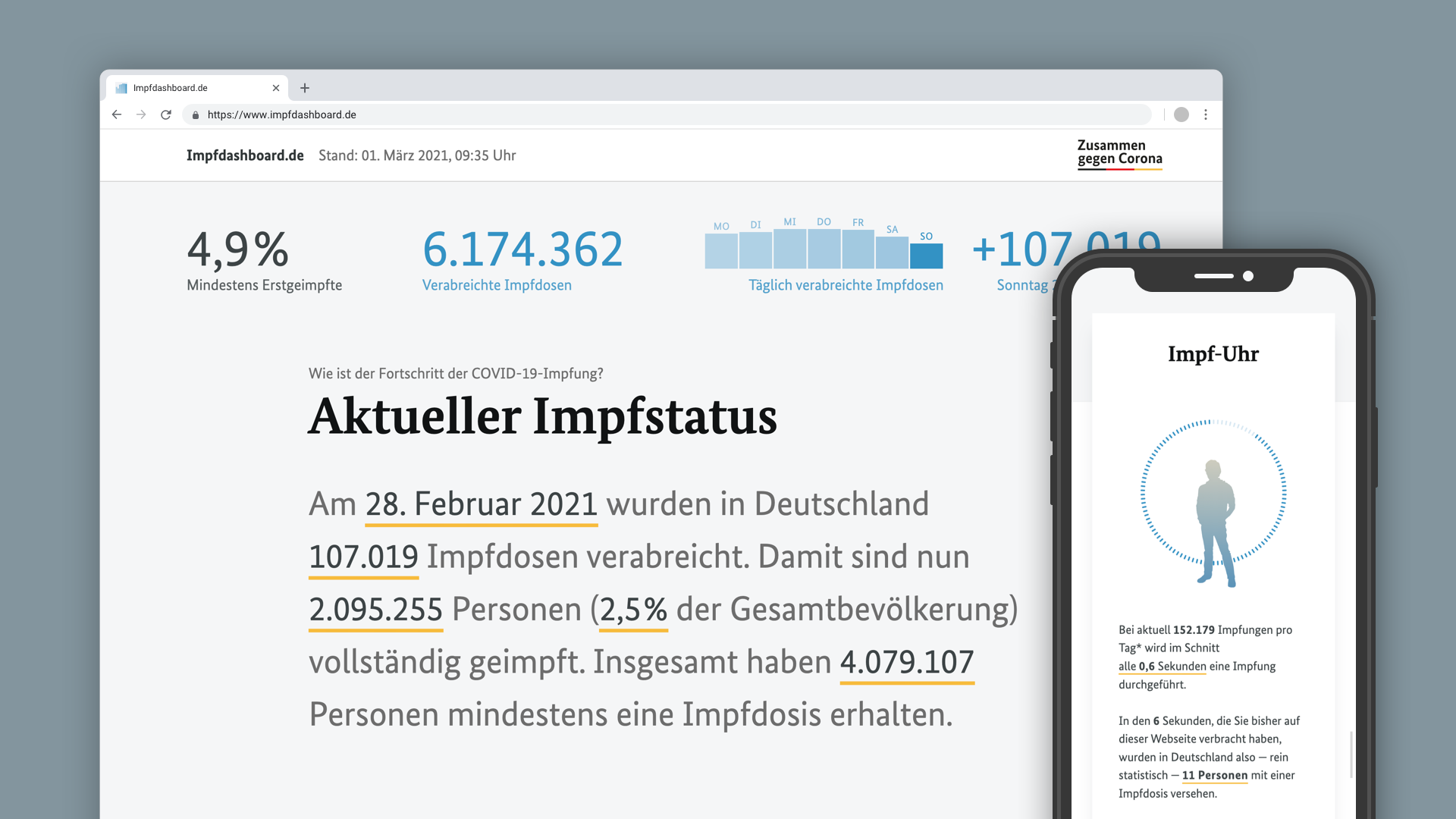
What’s a dashboard, anyways? Designing the official German COVID-19 vaccination dashboard
We all have seen lots of coronavirus dashboards by now, but the German COVID-19 vaccination dashboard stands out: designed mobile first, it features smart integration of text and charts, animations and even achievement badges, inspired from video games. What was the motivation behind this approach, how was it realized, and how has the dashboard evolved over this year? Moritz Stefaner will take us behind the scenes of this project which he conceived, designed and implemented together with Studio NAND and Cosmonauts & Kings.
Medias
.png)
Medias